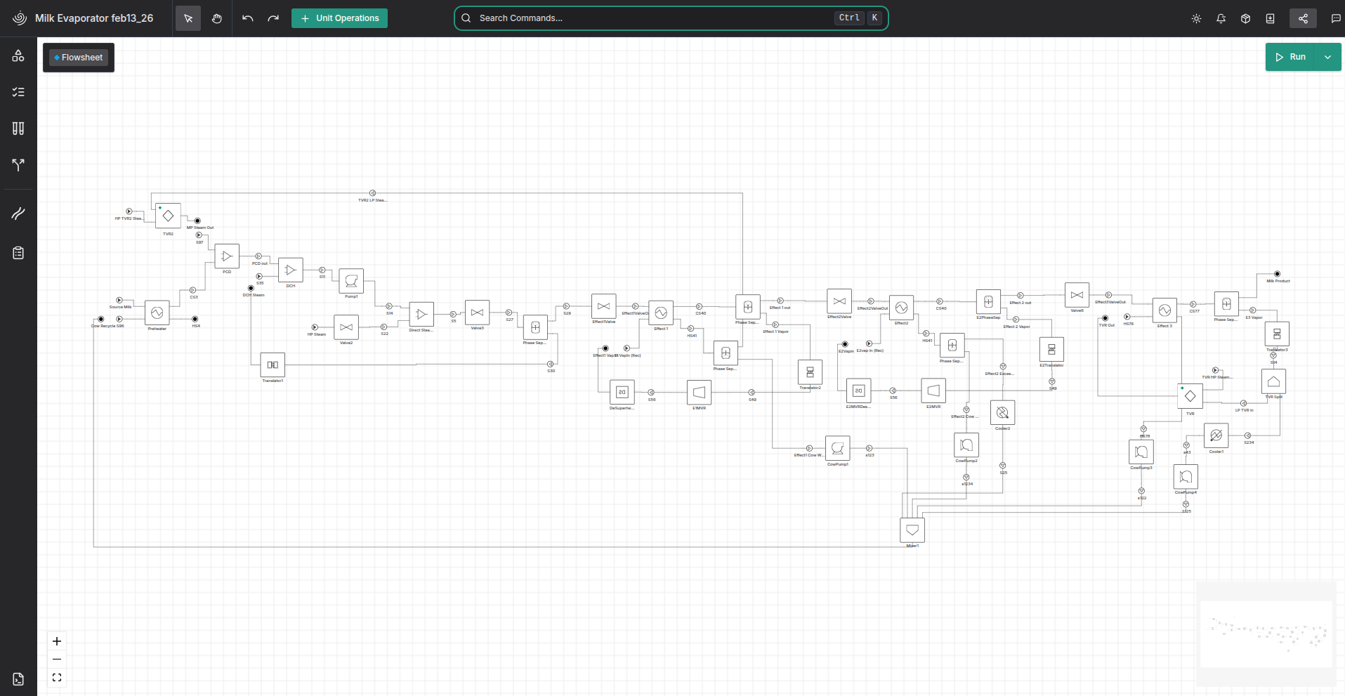
Evaporator 3 Effect
3 Effect Evaporator in the flowsheet
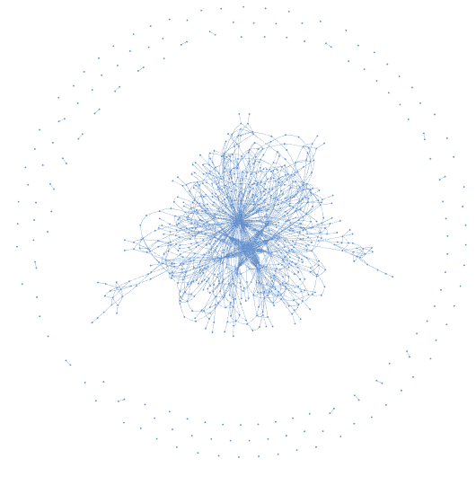
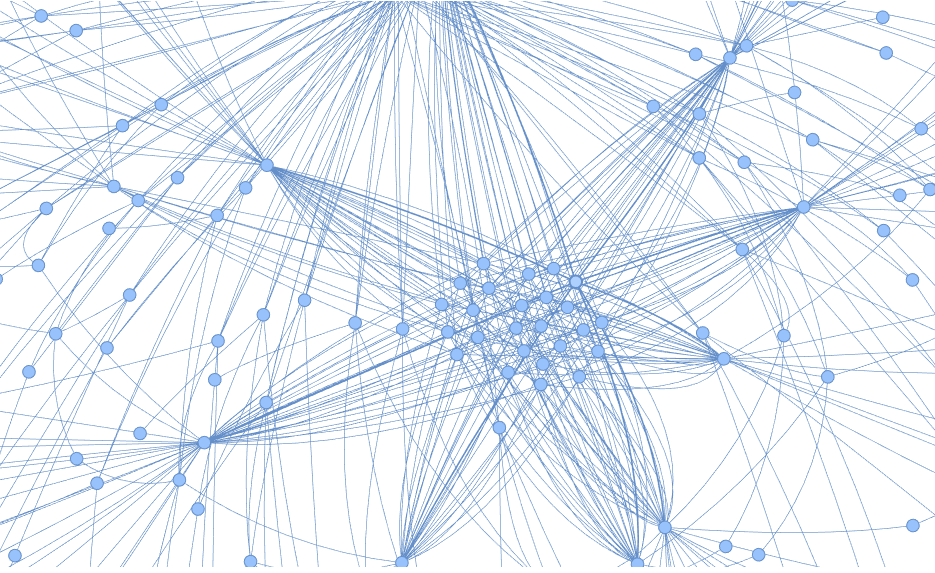
Bipartite graph of constraints and variables and their connections
This graph shows that the model is actually pretty densly connected, even though from the flowsheet layout it looks like it's quite spread out. though this is a bit of an illusion - it's really that everything is using the same coeffients in the property package. I would like to see a version which doesn't use the same coefficients like that everywhere, and I wonder if that somehow reduces the performance (even though duplicating the constants would add more fixed variables to the model, maybe it would be simpler to solve mathematically (could be subtly biasing the solver or something?))
The graph is a bipartite graph - there are nodes for the constraints, and nodes for the variables. the variables are connected to all the constraints they are used in.
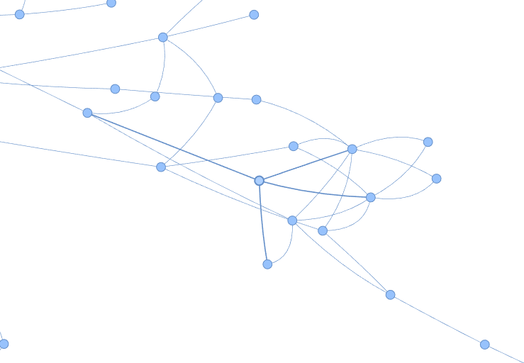
Area in the graph where only a few things are connected to each node
However on the outskirts of the graph, one node is not connected to many things. this is likely the more "high level" stuff - like a simple energy balance (enth_in + work = enth_out).
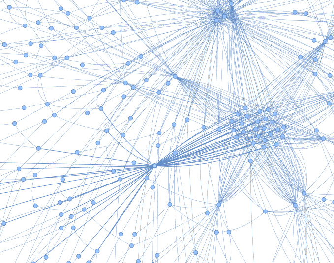
Area in the graph where one node is connected to many other nodes
There are some nodes that are connected to many other nodes. These are mostly to do with property packages, where each place might use the same variable. Or to do with things like splitters/mixers, that combine a lot of variables into one equation.
Area in the graph where many nodes are connected to similar things
There are also areas where many nodes are connected to very similar things. this is also often to do with property packages, as they all use the same constants in the property package etc. E.g Cp_mol_ig_comp_coeff
You can explore these graphs below: The red dots are the constraints - and larger red dots means they are further from their exact solution. Light blue shows fixed variables, and dark blue shows unfixed variables.
The below graph does not show the fixed variables. These are basically just constants. This better allows you to see the structure of the evaporator, including the recycles present in it too.
This could be used as a visualisation tool to debug failed solves.
Adding scaling factors also is interesting. In the below model, I have scaled everything using the autoscaler, and it shows that the constraints with the biggest problems are the Phase Fraction constraints (everything else is actually pretty good).
Oh, and by the way, these graphs are just for one effect. A model with 3 effects is wayy more complex, as there is a lot more variables and a lot more recycling going on. It doesn't separate very cleanly in 2d, but you can view it here (beware it might take a while to load).
Backlinks